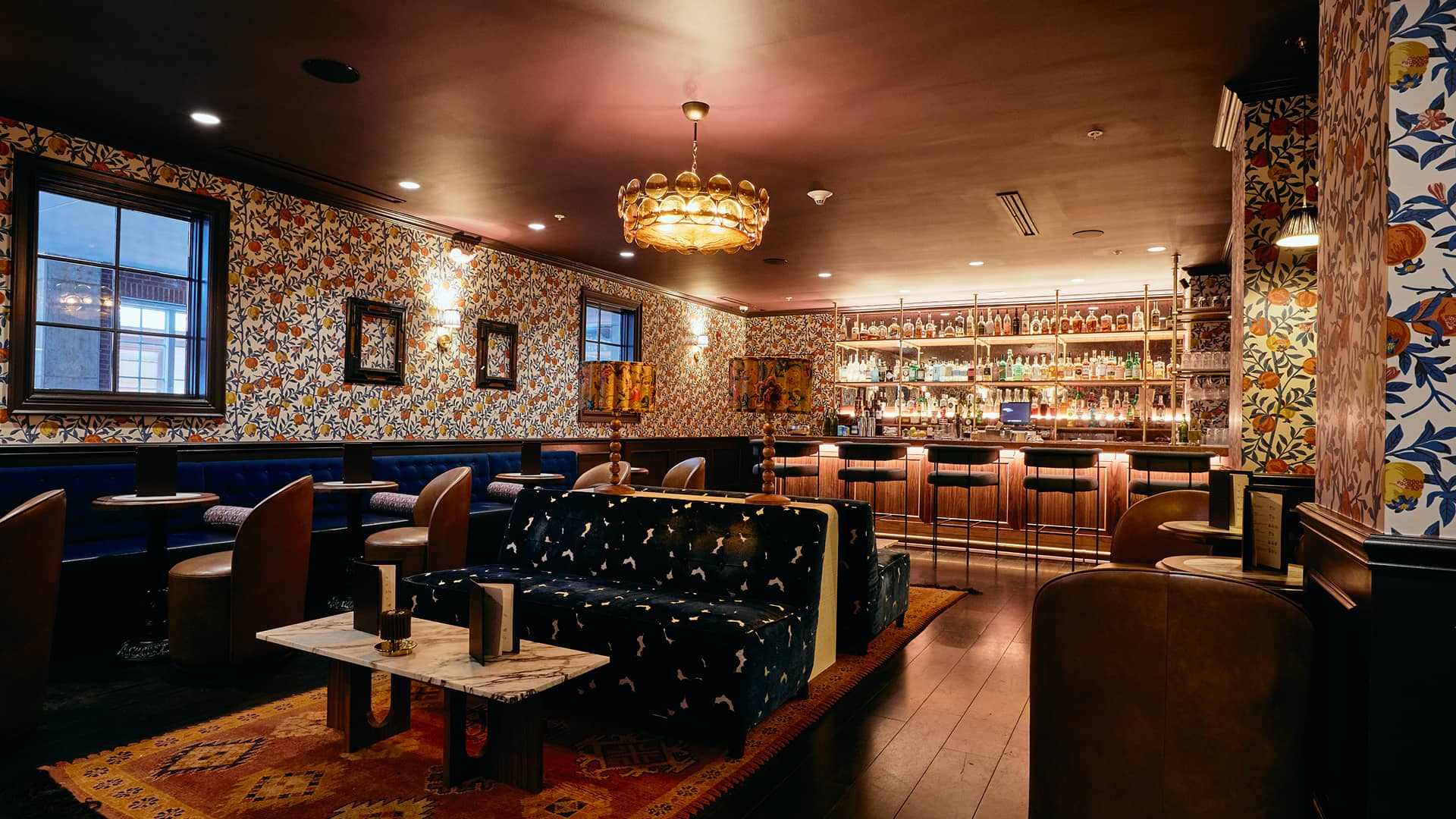
Welcome to The Oliver Hotel, where the nostalgic spirit of Ole Miss unites with a modern approach to southern hospitality in Oxford, Mississippi. Drawing from the vibrant energy, neighborly spirit, and historic charm found on The Square, the hotel offers a point of view that feels both familiar and eclectic.
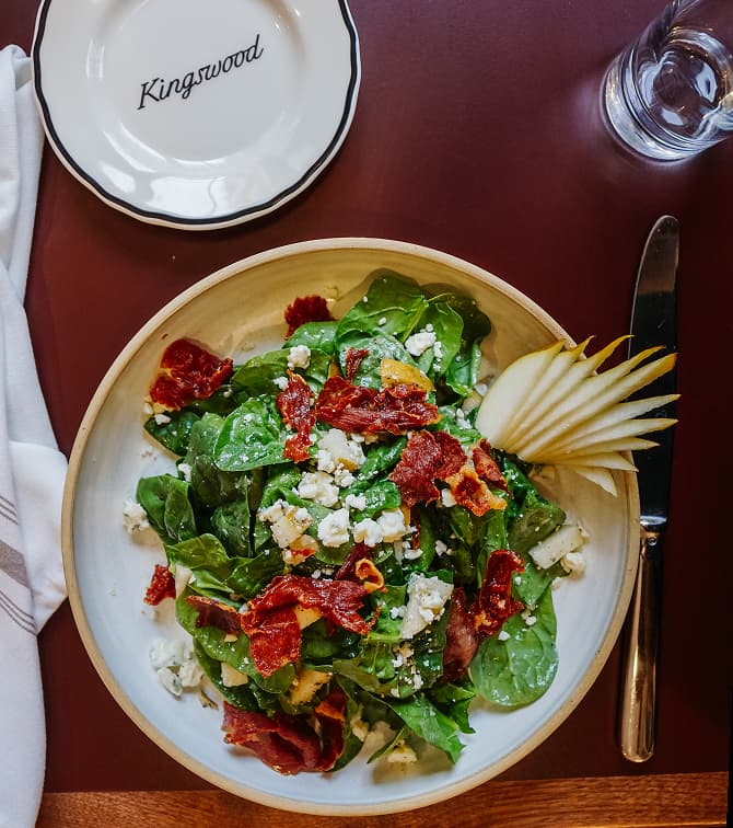
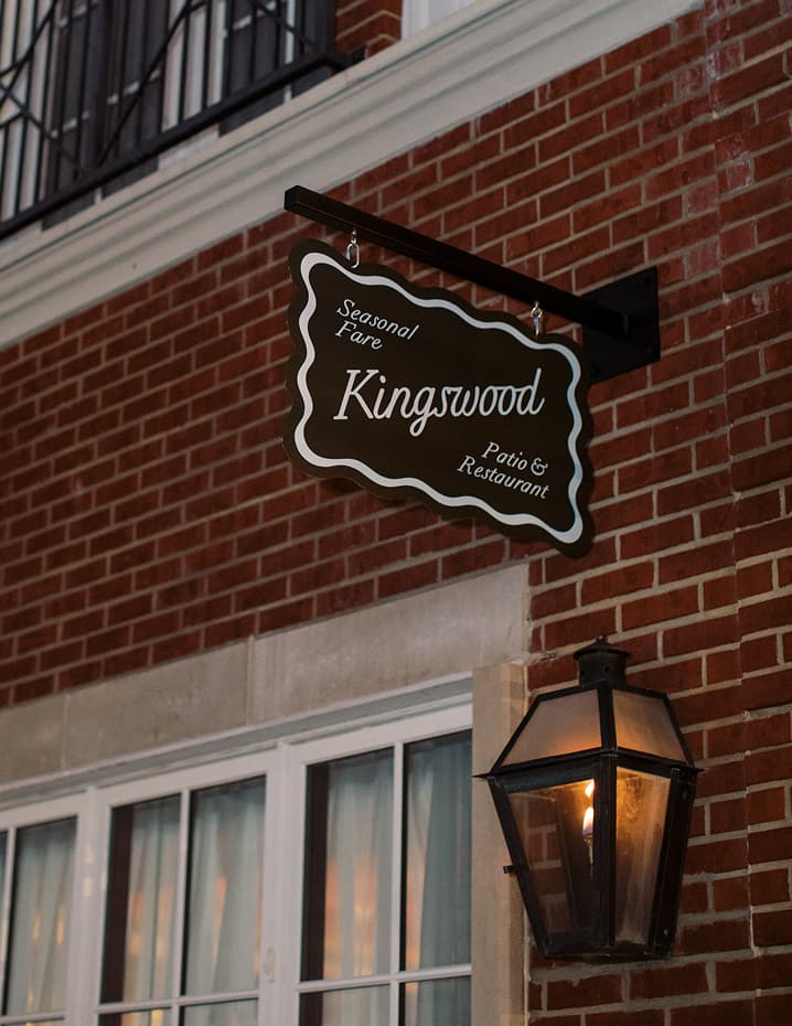
An existing hotel in Oxford in dire need of an overhaul, we were brought in to design a full brand system. We left our mark by developing everything from the narrative to the identity to signage and way-finding.
Drawing from southern hospitality, the historic charm found on the nearby square, and the enduring ties to Ole Miss University, our identity carries a familiar perspective that’s delightfully unexpected.
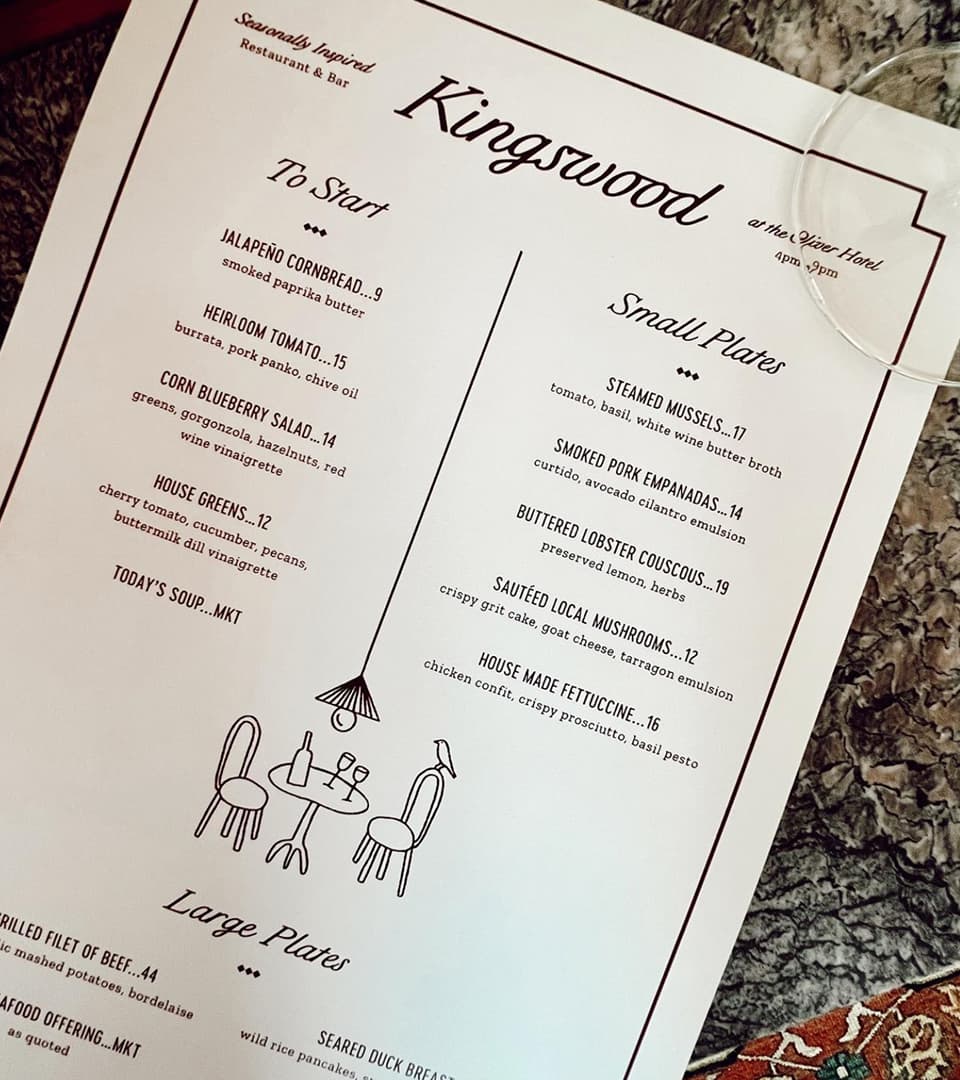
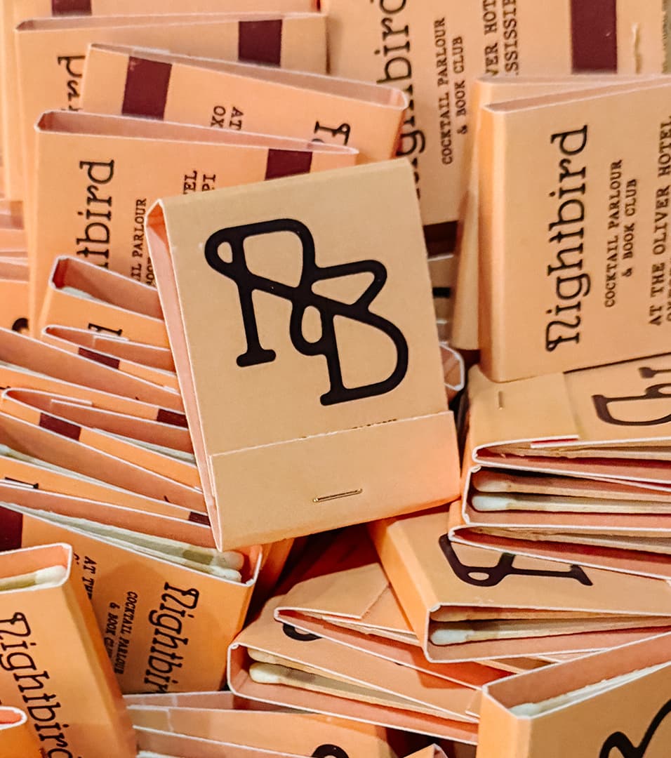
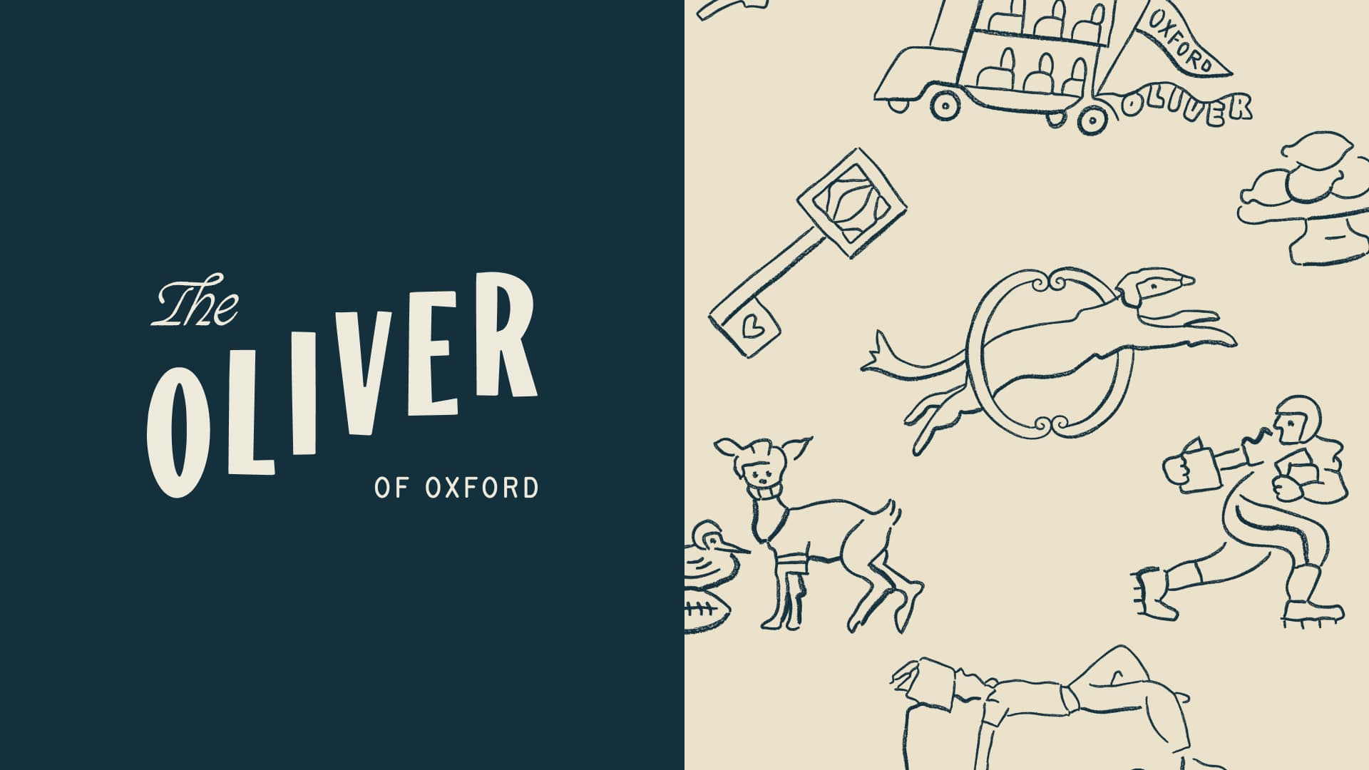
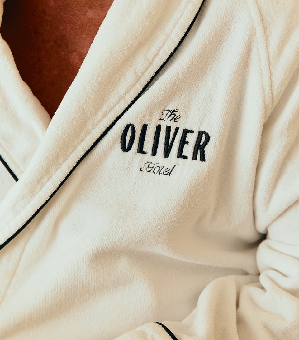
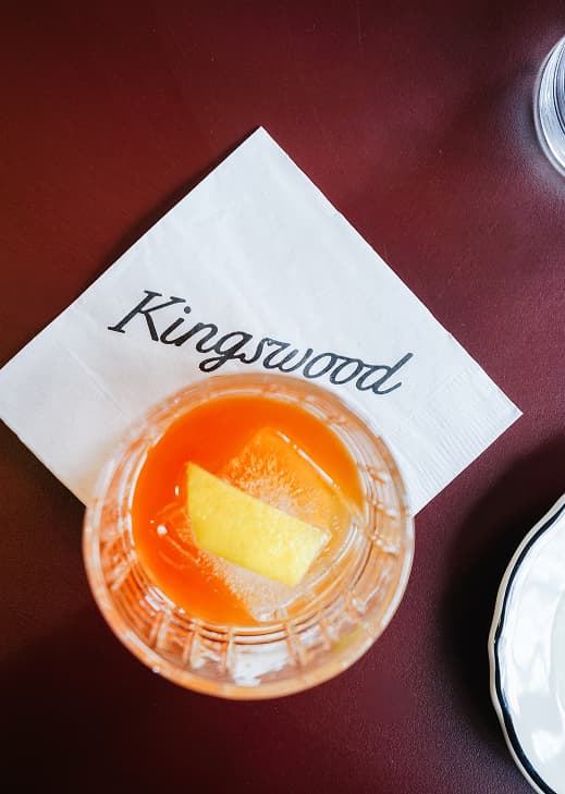
Our primary mark is grounded by a bold, almost collegiate, typeface but set on a diagonal to give it a more approachable feel. Combined with an ornamental script and a rounded sans, there’s a feeling of familiarity that comes with the brand.
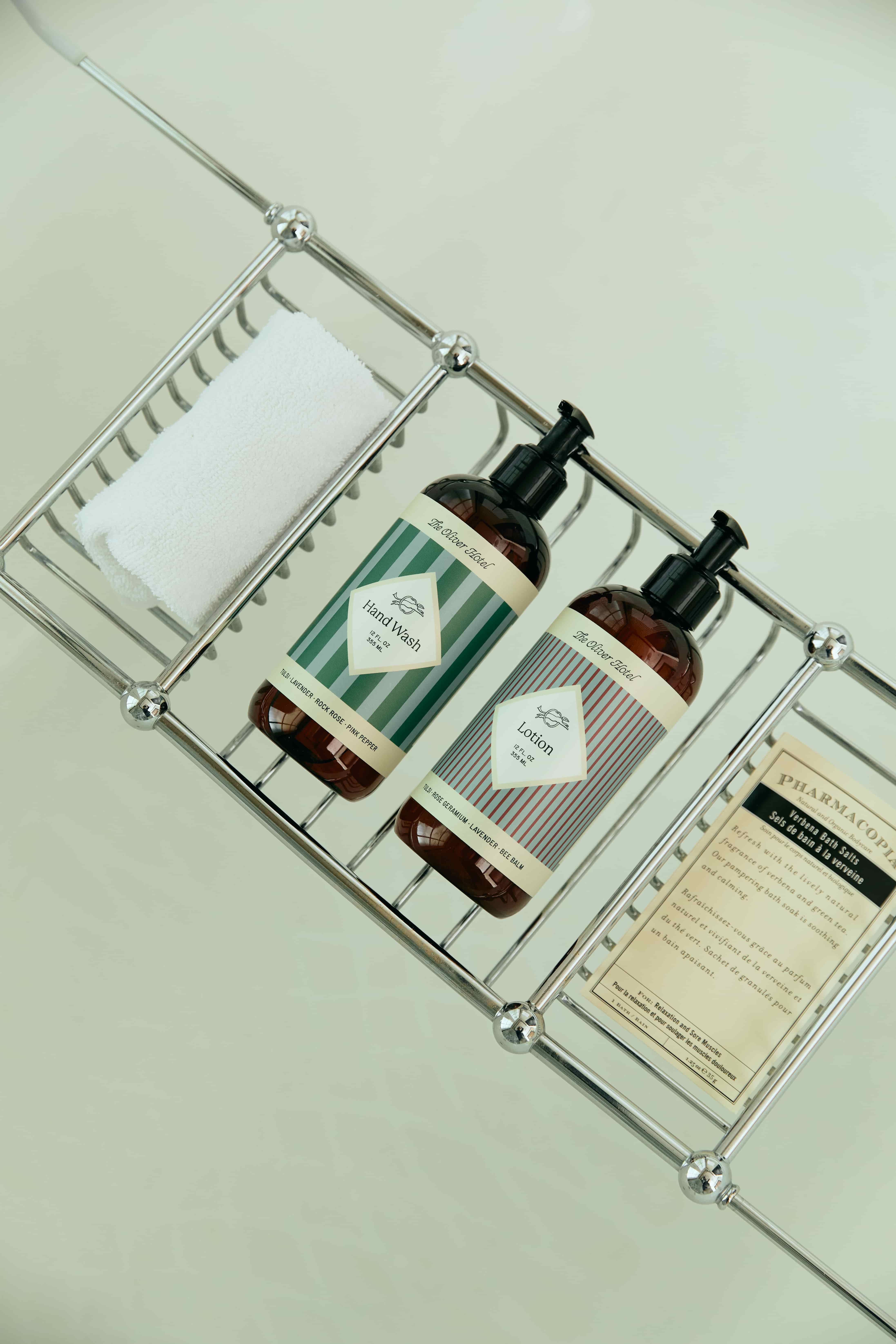
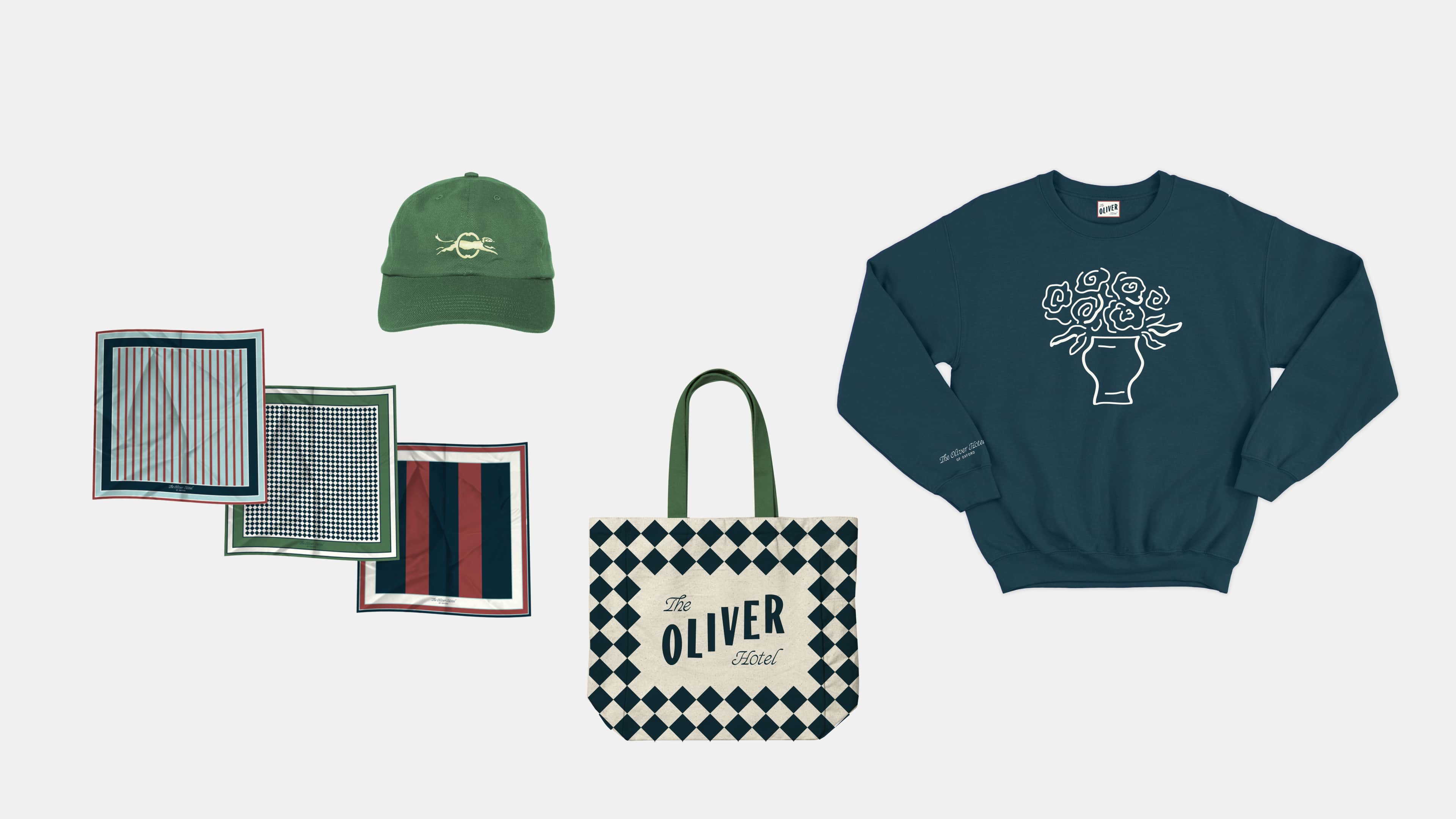
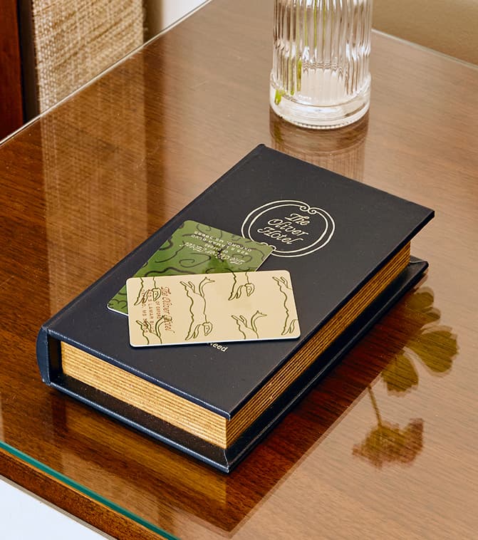
The color palette balances a trustworthy, academic tone with vibrant hues that add a nostalgic spirit and also provides some flexibility. Additionally, a series of decorative patterns ranging from traditional to artful and loose, were used to layer in an energetic homespun feel.
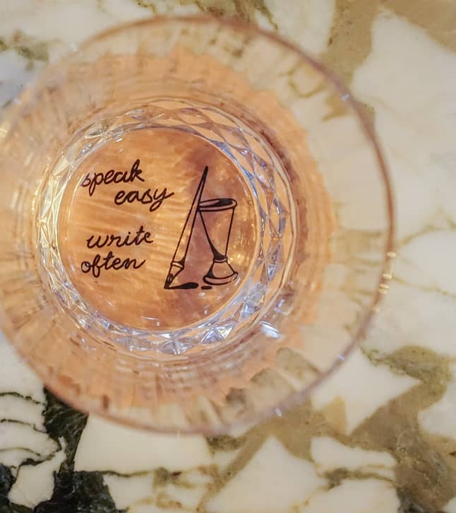
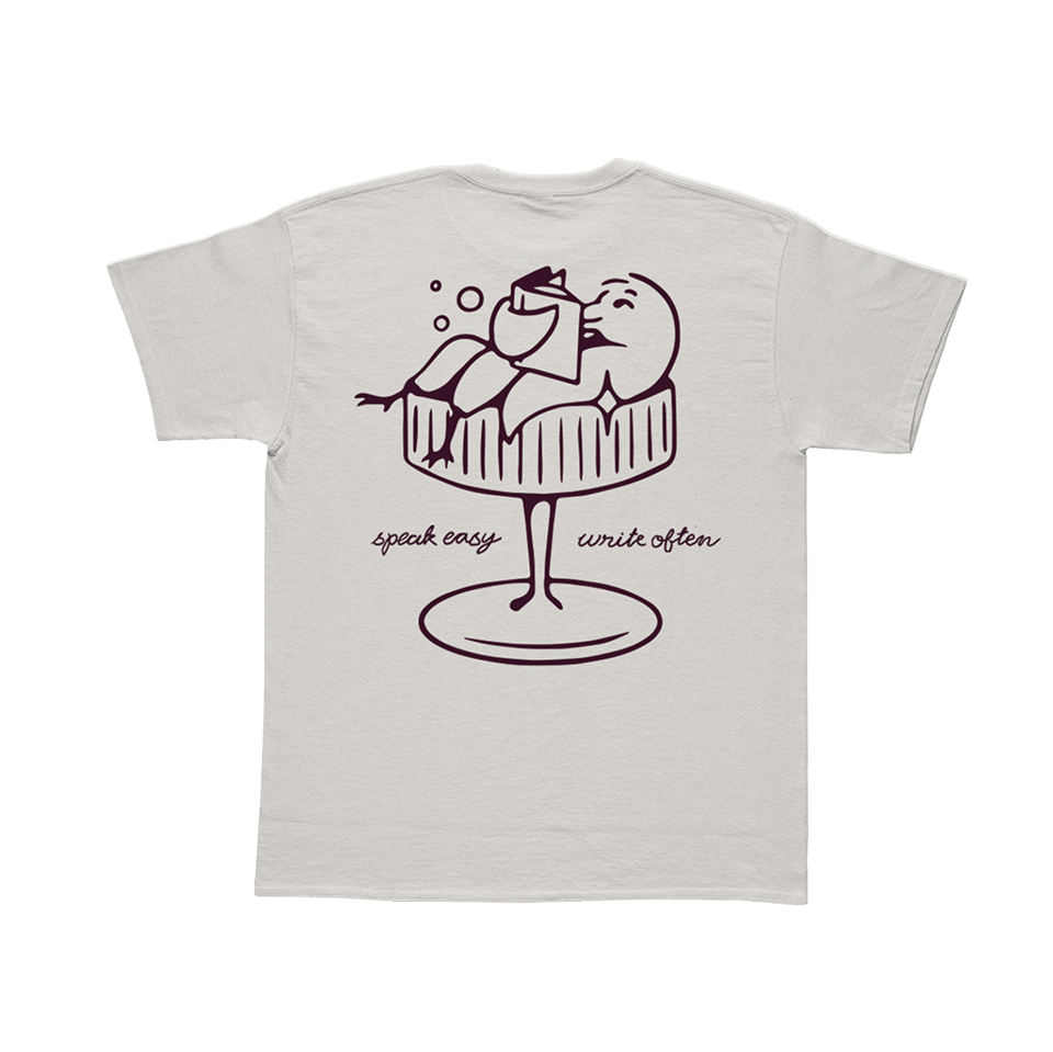
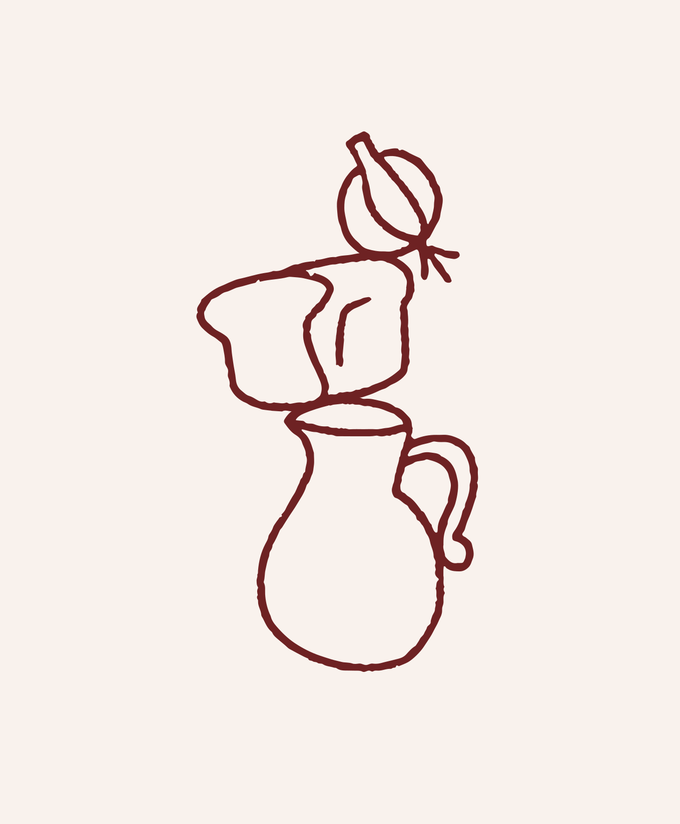
Our eclectic mix of illustrations highlights everything from local lore to experiences you might enjoy at the hotel, adding a touch of casual humor along the way.
Through tasteful takes on traditional aesthetics and a modern approach to southern hospitality, The Oliver Hotel offers an experience marked by both warmth and wit—a welcoming place for all things ole and new.
Welcome to The Oliver Hotel, where the nostalgic spirit of Ole Miss unites with a modern approach to southern hospitality in Oxford, Mississippi. Drawing from the vibrant energy, neighborly spirit, and historic charm found on The Square, the hotel offers a point of view that feels both familiar and eclectic.
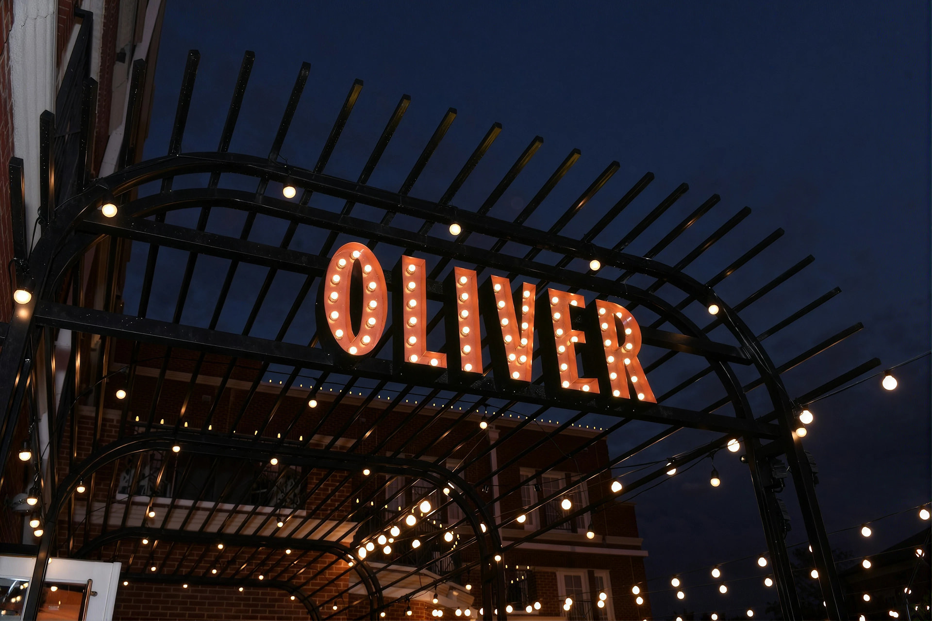
An existing hotel in Oxford in dire need of an overhaul, we were brought in to design a full brand system. We left our mark by developing everything from the narrative to the identity to signage and way-finding.
Drawing from southern hospitality, the historic charm found on the nearby square, and the enduring ties to Ole Miss University, our identity carries a familiar perspective that’s delightfully unexpected.
Our primary mark is grounded by a bold, almost collegiate, typeface but set on a diagonal to give it a more approachable feel. Combined with an ornamental script and a rounded sans, there’s a feeling of familiarity that comes with the brand.
The color palette balances a trustworthy, academic tone with vibrant hues that add a nostalgic spirit and also provides some flexibility. Additionally, a series of decorative patterns ranging from traditional to artful and loose, were used to layer in an energetic homespun feel.
Our eclectic mix of illustrations highlights everything from local lore to experiences you might enjoy at the hotel, adding a touch of casual humor along the way.
Through tasteful takes on traditional aesthetics and a modern approach to southern hospitality, The Oliver Hotel offers an experience marked by both warmth and wit—a welcoming place for all things ole and new.
.gif)


.jpg)