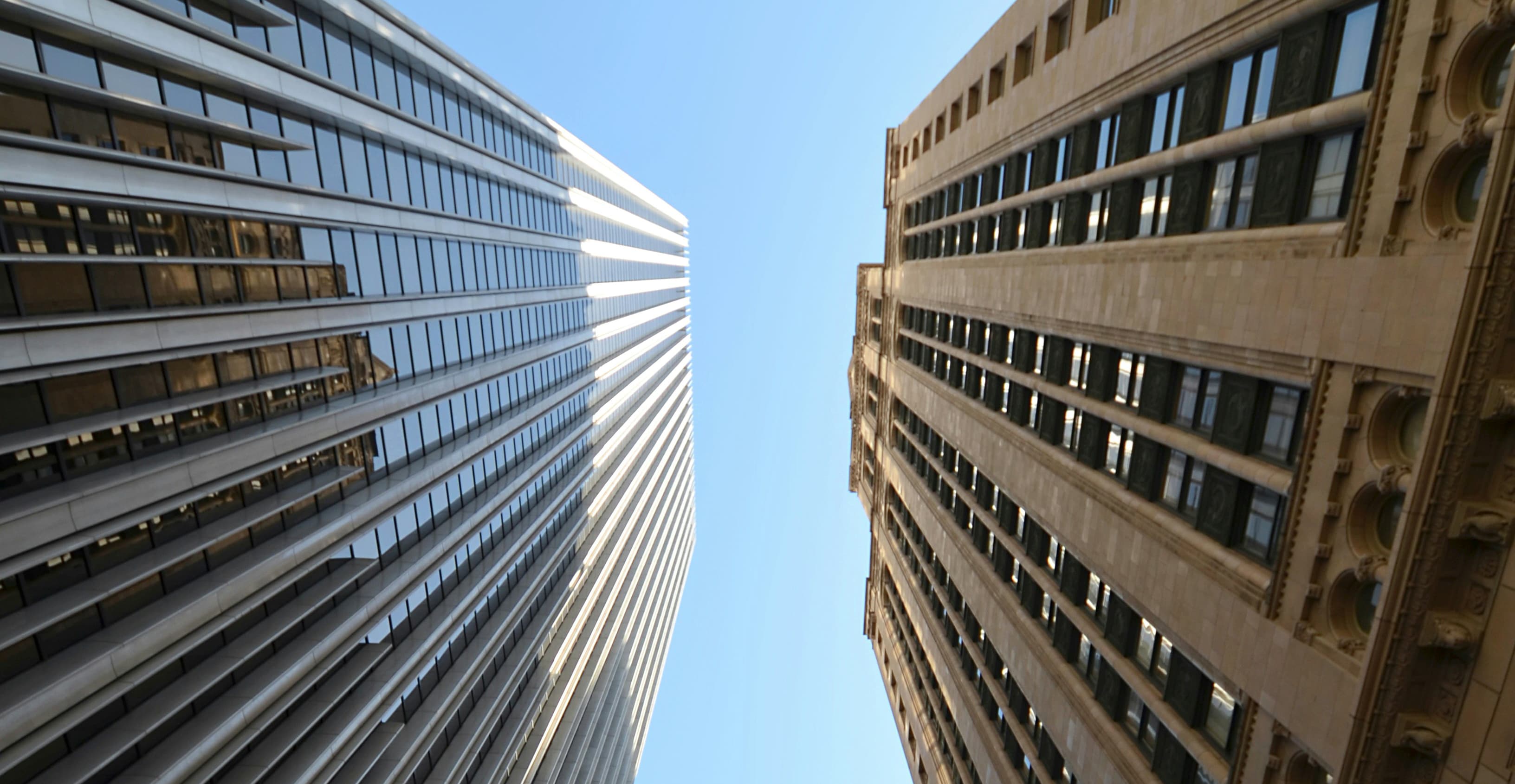
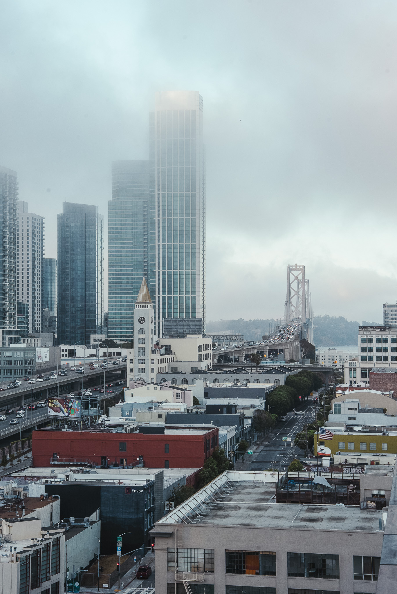
Quincy sits at the convergence of San Francisco’s downtown neighborhoods—a connector and a home base for discovery. The challenge was taking an existing wordmark and building a deeper world around it. The client needed more story, more texture, and more tools to express what Quincy really is: bold, rooted, and alive with possibility. We refined what was there and added layers that gave the brand a sense of both luxury and lived-in character.
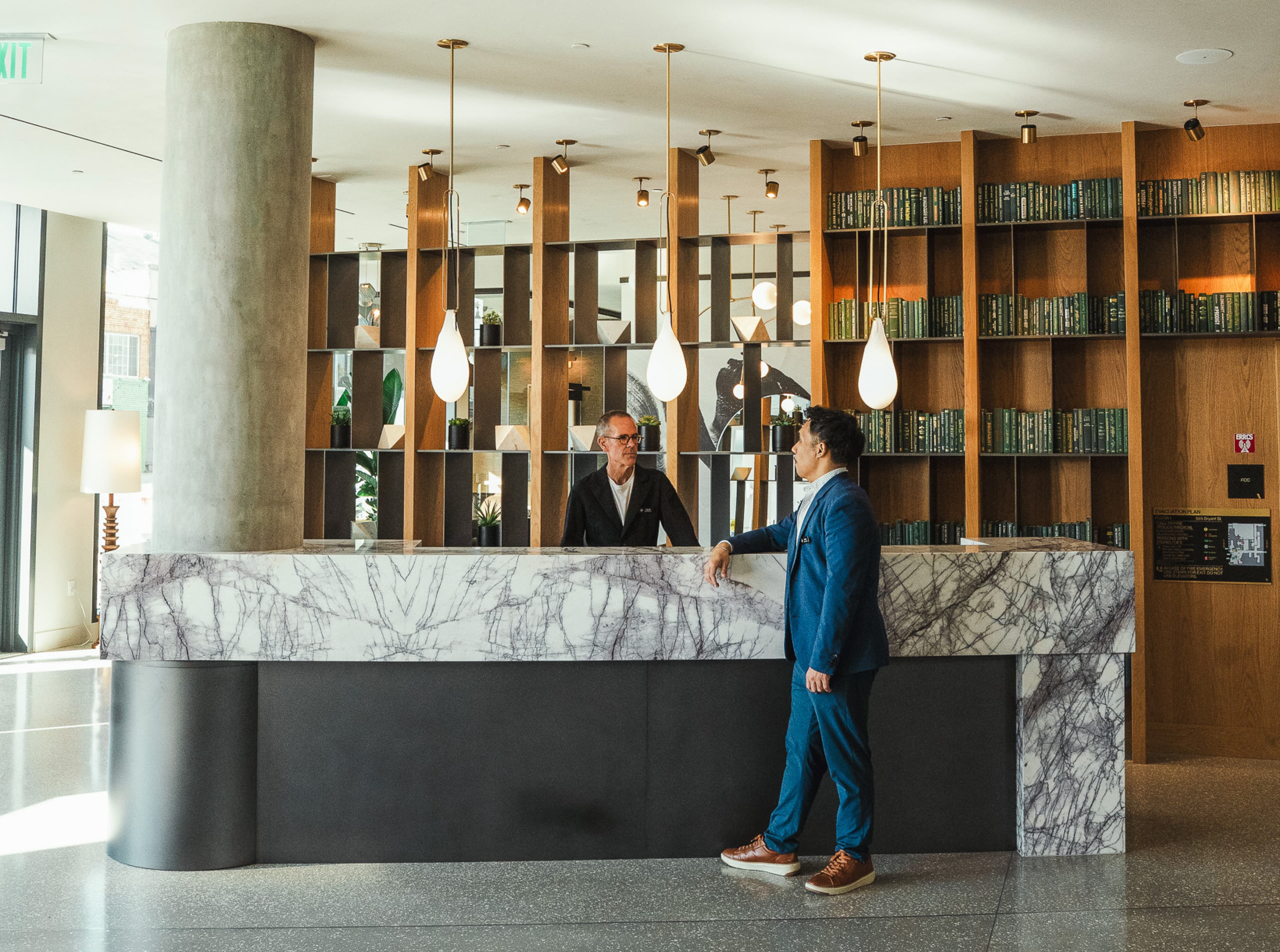
Our secondary mark—a stylized Q drawn in a single-line treatment and framed within a square nodding to San Francisco’s 7x7 grid—became both a bridge between neighborhoods and a confident shorthand for the brand. From that linework, we developed a supporting illustration library, a custom number font for wayfinding and digital applications, and a pattern system that gave Quincy a cohesive yet flexible vocabulary. Because Quincy arrived with a name and partial identity, our work focused on rounding out the story. We developed a brand narrative that then informed copy, illustration, layout, and supporting typography—reinforcing the idea of convergence and possibility, and ensuring the system could flex across signage, wayfinding, and digital with confidence. Collage-driven video treatments and a scattered type layout added a looser, more eclectic energy—balancing refinement with personality and keeping the brand approachable yet high-touch. For the website, we kept things clean and functional—building on a minimal base while layering in thoughtful brand details. Figma made the collaboration with our development partner seamless, and the final site reflected the same clarity and confidence as the identity system. The result is a brand that feels simple, considered, and vibrating with potential—rooted in San Francisco’s fabric and ready to grow with the city around it.
Quincy sits at the convergence of San Francisco’s downtown neighborhoods—a connector and a home base for discovery. The challenge was taking an existing wordmark and building a deeper world around it. The client needed more story, more texture, and more tools to express what Quincy really is: bold, rooted, and alive with possibility. We refined what was there and added layers that gave the brand a sense of both luxury and lived-in character.
Our secondary mark—a stylized Q drawn in a single-line treatment and framed within a square nodding to San Francisco’s 7x7 grid—became both a bridge between neighborhoods and a confident shorthand for the brand. From that linework, we developed a supporting illustration library, a custom number font for wayfinding and digital applications, and a pattern system that gave Quincy a cohesive yet flexible vocabulary. Because Quincy arrived with a name and partial identity, our work focused on rounding out the story. We developed a brand narrative that then informed copy, illustration, layout, and supporting typography—reinforcing the idea of convergence and possibility, and ensuring the system could flex across signage, wayfinding, and digital with confidence. Collage-driven video treatments and a scattered type layout added a looser, more eclectic energy—balancing refinement with personality and keeping the brand approachable yet high-touch. For the website, we kept things clean and functional—building on a minimal base while layering in thoughtful brand details. Figma made the collaboration with our development partner seamless, and the final site reflected the same clarity and confidence as the identity system. The result is a brand that feels simple, considered, and vibrating with potential—rooted in San Francisco’s fabric and ready to grow with the city around it.